Inhaltsverzeichnis
TKK
TTK widgets look more like operating system widgets and better than Tkinter widgets. On the other hand, the Tkinter widgets are easier to configure. The Combobox, Notebook, Treeview, Progressbar, Separator and Sizegrip widgets are only available as TTK widgets.
A GUI form is built with the help of widgets. These are the graphical components available in the Tkinter or TTK toolbar. In the following, basic information about the use of widgets is given, which is sufficient in many cases. More detailed information can be found in the Tkinter Reference.
A GUI program can be created with the  icon for new Tk/TTK application on the Program tab. Widgets can be placed by dragging and dropping or by clicking on a widget and then clicking in the GUI form. Only absolute layout is supported. This is perfectly sufficient for most purposes. Designing a GUI interface with layout managers is much more difficult.
Attributes and events of a widget are configured in the Object Inspector. Initially, only the most important attributes and events are displayed. This filtering simplifies the work with the Object Inspector. You can display more or all attributes and methods in two further stages.
Many widgets have a control variable (CV) that can be used to read a value from the widget with get() or to output a value to a widget with set(). The name of a control variable consists of the three parts „self.“, „name of the widget“ and „CV“.
self.<widget name>CV
The Python code of a GUI program is saved with the .pyw file extension, the associated form with the .pfm file extension. Both will open together. If you close the form, you can open it again using the  icon in the editor toolbar.
Label
 A Label widget is used to label widgets of a GUI form. It can display text, an image, or both.
To display an image, select the desired image file in the object inspector for the Image attribute.
An image can be animated using the place(x, y) method of the Label widget. The car example shows how this works.
Entry
 An Entry widget can be used to enter or output text or a number. The entered text is obtained via the get() method of the control variable CV belonging to the Entry widget.
EAN = self.eEANCV.get()
If you need a number, you convert the text into an integer with int() or into a decimal with float().
Example:
Amount= float(self.eAmountCV.get())
Text
 In contrast to the Entry widget, a Text widget represents a multi-line text. You can enter the text in the object inspector. At runtime, you can use the method shown in the example to output line by line to a Text widget named Output. The lines are separated from each other by the control character „\n“ (new line).
Beispiel:
    def output(self, line):
        self.Output.insert('end', line + '\n')
Button
 Each Button widget automatically gets an event method that is called when the button is clicked. When double-clicking a button in the GUI form, the cursor is placed at the beginning of the associated event method.
Example:
    def button1_Command(self):
        # ToDo insert source code here
        pass
Checkbutton
 A Checkbutton may or may not be selected. The current status is supplied by the associated control variable CV with the values 0 (not selected) or 1 (selected).
if (cbSelectedCV.get() == 0):
RadiobuttonGroup
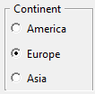
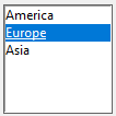
A RadiobuttonGroup offers several selection possibilities from which you can select an option. A newly created RadiobuttonGroup automatically has the three options „America, Europe and Asia“ and the label „ Continent “. In the object inspector, you can find these values in the Items respectively Label_ attribute and can easily adjust them there. If the RadiobuttonGroup should not have a frame delete the label.
The RadiobuttonGroup has a control variable CV that can be used to input or output the selected option:
Examples:
  print(self.rbgContinentCV.get()))
  self.rbgContinentCV.set('Asia')
Listbox
A Listbox displays a list of strings that you enter in the object inspector via the ListItems attribute. Depending on SelectMode one or more strings can be selected.
The list box has a control variable CV that gives access to all strings. For accessing the selected strings the list box has specific methods. curselection() returns a tuple with all positions of selected strings and get(i) the string at position i.
Examples:
    # output of the selected strings when SelectMode is browse or single
    i = lbContinent.curselection()[0]
    print(self.lbContinent.get(i)

    # output of the selected strings when SelectMode is multiple or extended
    for i in self.lbContinent.curselection():
        print(self.lbContinent.get(i))
For more listbox methods, see https://anzeljg.github.io/rin2/book2/2405/docs/tkinter/listbox.html.
Combobox
 A Combobox is a combination of an input line and a drop-down selection list. The user can enter text in the input line or select a list item at runtime. In the object inspector, the Values attribute can be used to enter strings in the selection list.
The Combobox has a control variable CV that can be used to read or write the input line.
print(self.combobox1CV.get())
Spinbox
A Spinbox allows you to select a number from a range or a string from a given list. In the object inspector you define minimum (From_), maximum (To), increment (Increment) and current value (Value) for a number range. A list of strings is entered in the Values attribute.
A control variable CV belongs to the Spinbox, which can be used to query the selected value.
Example:
print(self.spinbox1CV.get())
Scrollbar
A Scrollbar can be used to scroll, in which the visible section of a displayed text or graphic is moved. Some widgets such as Entry, Text, Listbox or Canvas can easily be provided with horizontal or vertical scrollbars using the Scrollbar attribute.
Message
The Message widget is similar to the Label widget, but is intended for displaying multiple lines of text.
Canvas
 A Canvas is a rectangular area for drawing graphics.
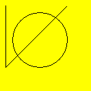
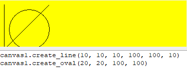
The example was drawn using these drawing commands.
    self.canvas1.create_line(10, 10, 10, 100, 100, 10)
    self.canvas1.create_oval(20, 20, 100, 100)
A documentation of the drawing commands can be found under https://anzeljg.github.io/rin2/book2/2405/docs/tkinter/canvas.html.
Frame
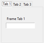
 A Frame is a container for other widgets. For example, the RadiobuttonGroup is a Frame that contains radio buttons. Frames are a good way to structure graphical interfaces. To place a widget in a Frame, click on it in the TTK toolbar and then click in the Frame.
Frames are used, for example, in the Notebook widget.
LabelFrame
Scale
 The purpose of a scale widget is to specify a numerical value within a certain range.
A scale widget has a control variable CV to read or write the current value.
print(self.scale1CV.get())
LabeledScale
PanedWindow
 A PanedWindow is a container for child widgets. Each PanedWindow contains a horizontal or vertical stack of child widgets. Using the mouse, the user can drag the boundaries between the child widgets back and forth. In the example, there is a canvas at the top and a text widget at the bottom.
To insert a widget into a PanedWindow, first click the widget in the TTK toolbar and then click in the PanedWindow.
Menu
 A Menu widget is a menu bar with collapsible submenus.
The Menu is defined via the MenuItems attribute, in which the menu structure is generated by appropriate indentation. With a newly created menu, the structure looks like this:
File
  New
    Python
    XML
  Load
  Save
Edit
  Copy
  Paste
  -
  Delete
Event methods are created for the menu items, which are called when the menu item is selected.
    def menu1FileNewPython_Command(self):
        # ToDo insert source code here
        pass
PopupMenu
 A PopupMenu is a context menu that is invoked with the right mouse button. As with the Menu widget, it is defined via the MenuItems attribute.
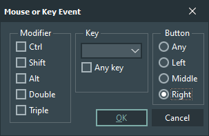
You can assign a PopupMenu to each widget. To do this, open the Events tab in the object inspector and select Button „Right“ for the ButtonPress event.
In the event method that is created, you program the display of the PopupMenu at the clicked position.
    def root_ButtonPress(self, event):
        self.popupMenu1.post(event.x_root, event.y_root)
        pass
Menubutton
 A Menubutton is a button that displays a PopupMenu when clicked.
The PopupMenu must also be created and then entered in the Menu attribute of the Menubutton.
OptionMenu
 With an OptionMenu you can select an item from a given string list in the manner of a menu. The string list is specified in the MenuItems attribute.
The selected option is accessed via the CV control variable.
print(self.optionMenu1CV.get())
Notebook
Treeview
 A Treeview represents a hierarchical structure in a tree-like manner.
By appropriate indentation, the structure is specified via the Items attribute. This structure is predefined at the beginning:
First
  node A
  node B
Second
  node C
    node D


